Candle Coloring
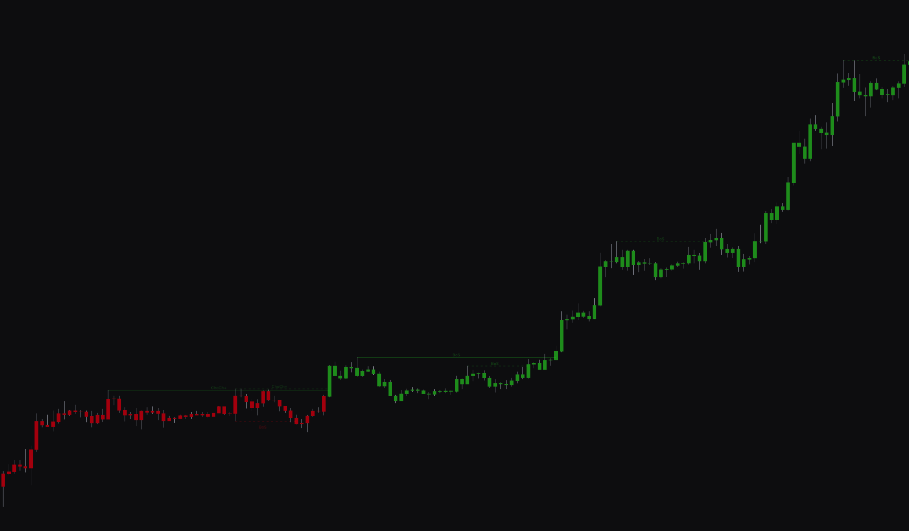
The Candle Coloring feature provides an immediate, visual representation of the underlying market structure directly on your price chart. Instead of analyzing multiple separate ind
Overview#
The Candle Coloring feature gives you an immediate, visual view of the underlying market structure directly on your price chart. Instead of analyzing multiple separate indicators, this tool color-codes your candles based on the dominant short-term and long-term market trends, so you can analyze them quickly.
When enabled, candles change color to reflect whether the current market structure is bullish or bearish. This helps you identify the prevailing trend and spot potential shifts in momentum.
Settings#
You can enable or disable the Candle Coloring feature and customize the colors for both short-term and long-term market structures.
| Setting | Description |
|---|---|
| Candle Coloring | Enables or disables the candle coloring feature. When set to Market Structure, candles are colored based on the active trend. |
Best practices and usage#
- Quick trend identification: Use the candle colors to gauge the current market trend. Consistent bullish colors suggest an uptrend, while consistent bearish colors indicate a downtrend.
- Identify trend alignment: Look for moments when both short-term and long-term structures are aligned (e.g., both showing bullish colors). This can indicate a high-conviction trend. In the settings, long-term colors take priority over short-term ones.
- Spot trend changes: A change in candle color can signal an early shift in market structure, giving you a heads-up for potential reversals or the start of a new trend.