Tools
The Swift Trend and Ultra Trend lines are dynamic, AI-powered tools that visualize short-term and long-term market trends directly on your chart. Unlike traditional moving averages
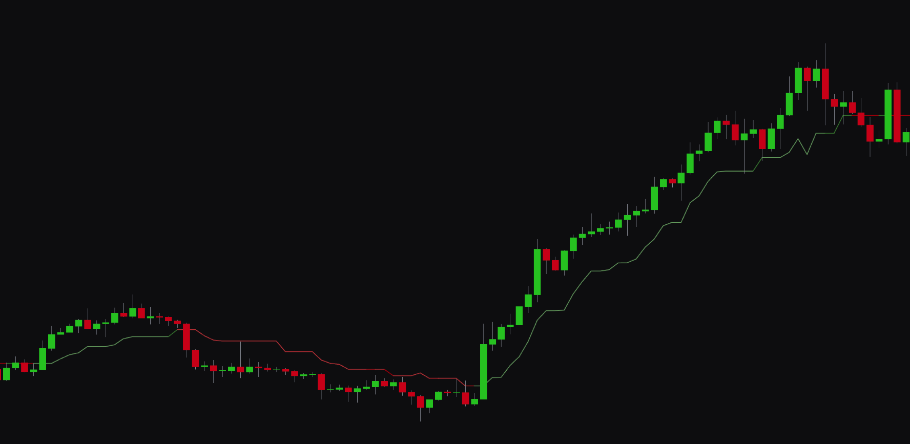
Swift Trend & Ultra Trend#
Overview#
The Swift Trend and Ultra Trend lines are dynamic, AI-powered tools that show short-term and long-term market trends on your chart. Unlike traditional moving averages, these trend lines use an algorithm that adapts to market volatility, which makes them responsive to price action and less prone to lag.
- Swift Trend: shows the shorter-term market trend.
- Ultra Trend: shows the longer-term market trend.
When the price crosses above a trend line, it shows a potential bullish shift. A cross below suggests a bearish shift.
Best Practices & Usage#
- Identify trend direction: use the lines to quickly read the overall market direction. If the price is above both lines, the trend is strongly bullish. If it is below both, the trend is strongly bearish.
- Dynamic support and resistance: the trend lines can act as dynamic support in an uptrend and resistance in a downtrend.
- Spot trend changes: a crossover of the price and a trend line can signal an early change in market direction. A crossover of the Swift Trend and Ultra Trend lines can signal a more significant shift in momentum.
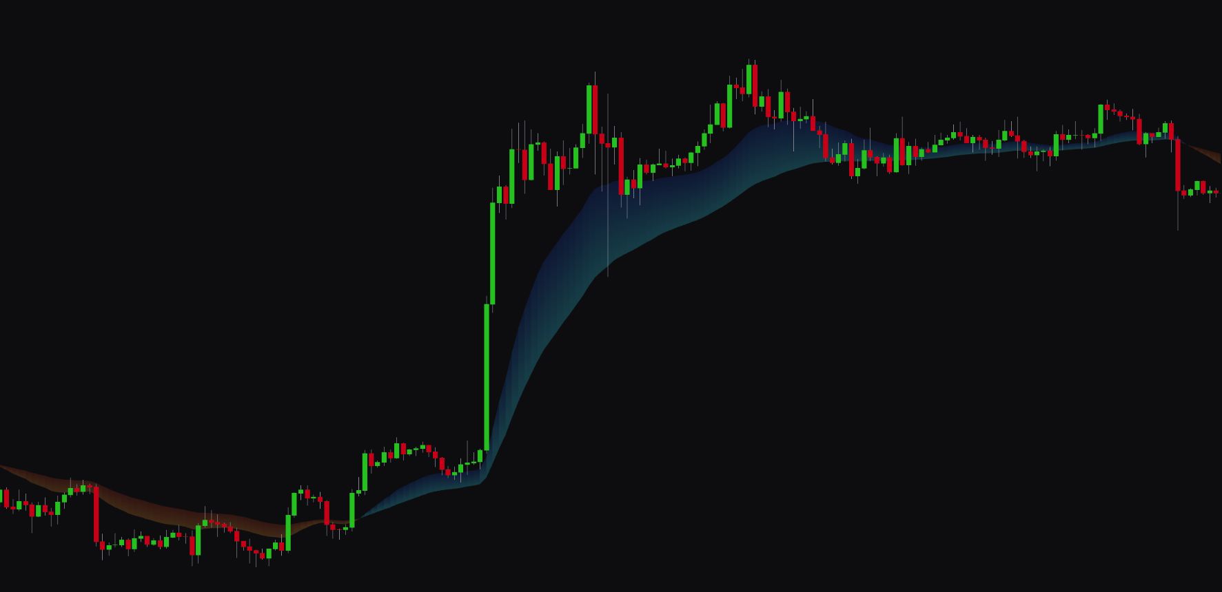
Surge Flow#
Overview#
Surge Flow is a visual tool that shows long-term trend direction and momentum through a colored cloud on your chart. It helps you identify the dominant market flow and stay on the right side of major trends.
- Blue Cloud: shows a bullish market flow.
- Orange Cloud: shows a bearish market flow.
The width and angle of the cloud can also give you insight into the strength of the momentum.
Best Practices & Usage#
- Confirm long-term trends: use Surge Flow to confirm the direction of the primary trend. Trading in the direction of the cloud can improve the probability of your trades.
- Identify trend shifts: a change in the cloud's color from orange to blue can signal the start of a new uptrend. A change from blue to orange can signal a new downtrend.
- Gauge momentum: a widening cloud suggests momentum is increasing. A narrowing cloud can show momentum is fading, which may warn of a consolidation period or reversal.
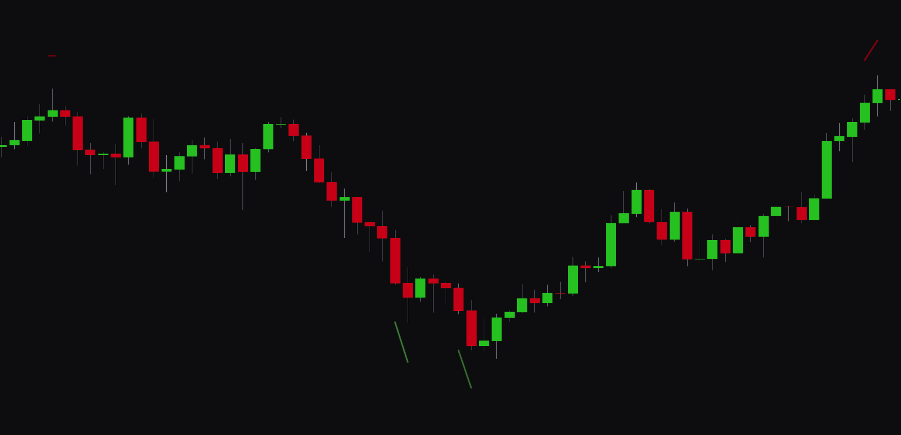
Vision Pulse#
Overview#
Vision Pulse is a predictive tool that uses an algorithm to identify potential market moves before they happen. When the tool anticipates a bullish or bearish impulse, it plots a colored line below or above the candles as an early warning.
- Green Line Below Candles: signals a potential bullish move.
- Red Line Above Candles: signals a potential bearish move.
Best Practices & Usage#
- Anticipate breakouts: use Vision Pulse signals to prepare for potential breakouts from consolidation or ranges.
- Confirm entries: a Vision Pulse signal that aligns with a primary signal from the indicator (e.g., a "Buy" signal) can add extra confirmation to your trade idea.
- Be aware of volatility: Vision Pulse often appears ahead of high-impact news or market-opening volatility, which makes it useful for risk management.
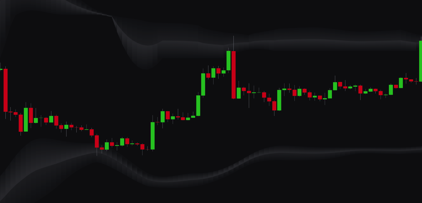
Reversal Clouds#
Overview#
Reversal Clouds are dynamic zones plotted on your chart that highlight potential market reversal areas. These clouds are based on statistical analysis of price action and identify levels where a trend is likely to become exhausted.
- Upper Cloud: a potential bearish reversal zone (resistance).
- Lower Cloud: a potential bullish reversal zone (support).
Best Practices & Usage#
- Identify key levels: use the Reversal Clouds to spot areas of potential support and resistance where price might turn.
- Time your exits: if you are in a long trade and the price enters the upper Reversal Cloud, it could be a good time to consider taking profits. The same applies to short trades and the lower cloud.
- Look for reversal entries: a "Buy" signal that appears while the price is inside the lower Reversal Cloud can be a strong setup. A "Sell" signal in the upper cloud can also be a strong entry confirmation.
Candle & Chart Coloring#
Overview#
The Candle Coloring, Chart Background Coloring, and Overlay Line Coloring features help you visualize market dynamics at a glance. You can set each of these visual tools to reflect one of several key data points, so you can quickly read the market environment.
Settings#
You can choose one of the following data sources to drive the coloring of the candles, chart background, or overlay line:
| Setting | Description |
|---|---|
| None | Disables the custom coloring. |
| Signals | Colors are based on the active "Buy" or "Sell" signals. |
| Clarity AI | Colors are based on the real-time score from the Clarity AI engine. |
| Clarity AI & Signals | Colors are based on a combination of the Clarity AI score and active signals. |
| Market Trend | Colors reflect the dominant trend direction (bullish or bearish). |
| Market Strength | Colors indicate the strength of the current trend. |
| Smart Activity | Colors show detected institutional or "smart money" activity. |
| Market Volatility | Colors represent the current level of market volatility (high or low). |